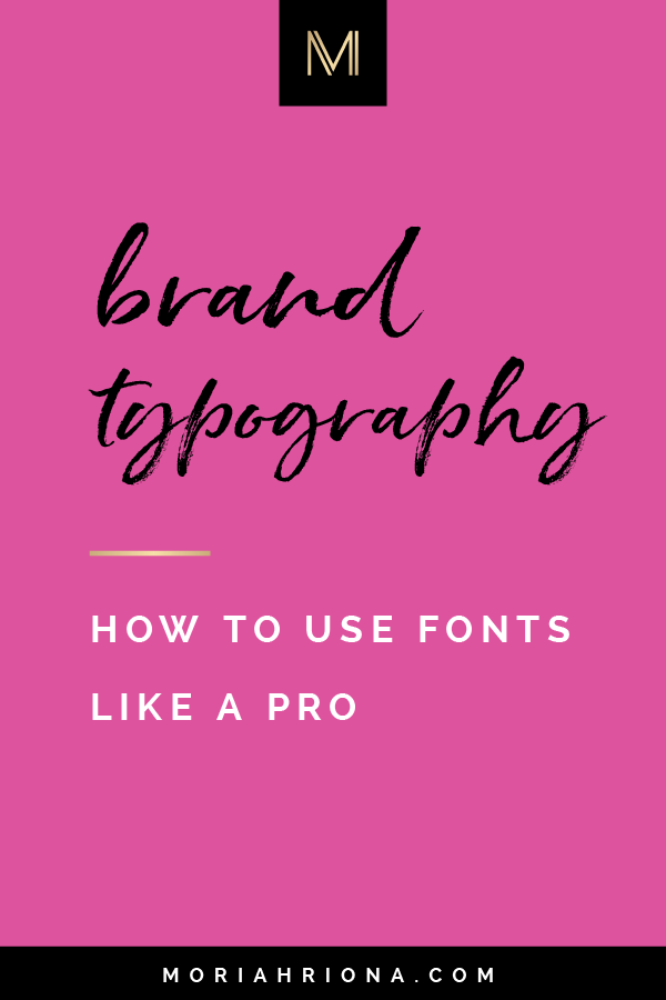
Brand Identity Design: How To Use Fonts In Your Brand


Mar 21
One of my favorite parts of The Branding Experience (my brand identity design service) with my clients is selecting their brand fonts. It’s a task I take very seriously.
The right font can elevate a brand’s status to high end and exclusive.
The wrong font can make it feel cheap and undesirable (hello comic sans!).
So if you’ve been haphazardly choosing your brand fonts, today’s video is for you, friend!
Brand Identity Design: How To Use Fonts In Your Brand

Shop The Look

What Is Typography?
Typography is the visual component of the written word. [source]
As a trained graphic designer, typography is one of my favorite elements of design. It’s also the thing I get most irritated by when I see blunders.
Basically, typography is the study of fonts, and typographical characters and how they are handled in design.
Great typography will take a message (the words) and elevate it to a higher level of understanding and significance.
Bad typography will confuse or lose the message all together.
Unfortunately I come across so many cringe-worthy typography issues in my line of work — especially when brands are DIY-ing their visual branding. So I’m going to help better understand typography and how to use fonts in your brand!
Typography & Great Brand Identity Design
When it comes to visual branding design and typography, there are two things you want to remember:
1. Consistency is Key
Great branding design (and that brand’s typography) is consistently consistent.
Sounds silly — but it’s true!
By being consistent with your brand’s typography (i.e. the fonts you use, and the handling of the type) you are building trust with your audience.
They start to notice your consistent brand aesthetic and know what to expect. It’s comforting, and builds trust.
2. Great Design is Invisible
Also sounds silly, but true!
In graphic design the most important thing is the message. The design is a visual way to communicate that message — so it should never over shadow it.
A lot of DIY-ers will choose fun/pretty fonts simply because they like them. But this can damage the brand if the ornateness of the font becomes overwhelming, or the words become hard to read. Then the message becomes lost.
Your brand’s typography should be flawless. It should feel effortless (when we all know that great design isn’t effortless at all!)
Great brand design elevates the message. It is is subconscious — it feels:
- Significant
- Sophisticated
Your brand typography should perfectly communicate your message without drawing attention to itself.
Wondering how to accomplish this mighty task?
Well, my first bit of advice is to hire a professional brand designer (hello! Ready to go next level — well, let’s chat girl!)
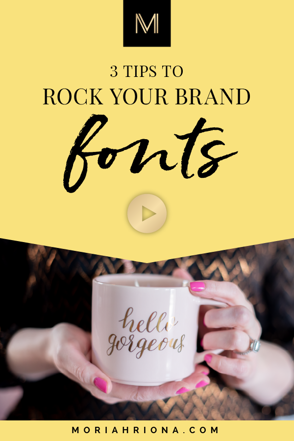
However, if you’re determined to DIY, here are my top 3 tips:
1. Select Brand Fonts
Like I said, selecting brand fonts is part of the process for all of my branding clients.
More than that, I actually establish the typography for the branding system — I select the fonts that will be used, and then build rules for HOW to use them (including size, color, weight, etc.).
Then my clients are able to use their brand fonts consistently across all brand communications — which, as I mentioned, helps to build trust with their audience.
2. Use 2-3 Fonts Max in Your Brand Identity
This is a big one. Especially for DIYers.
I know people can all get a little gung-ho when selecting fonts (it’s like a kid in a candy store). They’re all so pretty — so more fonts equals more pretty, right?
Wrong.
Too many fonts can be convoluted and distracting. Remember the point above about great design and great typography being invisible?
That’s why I recommend selecting only 2-3 fonts for your visual branding system. And sticking with them.
3. Create Visual Hierarchy
In graphic design, hierarchy is the concept of using elements of that design to signify importance (compared to the overall design).
Even though you’ll only have 2-3 brand fonts, you can still create hierarchy and distinction amongst those fonts. You can manipulate the type by changing the size, color, weight, etc. to communicate importance.
This is especially important in design pieces that have large amounts of text. Take your “about” page for example.
This is a place where I commonly see DIYers and people using simple website templates fail — they have massive blocks of text, all in one style, to tell their “about me” story.
When any visitor lands on that page they’ll quickly click away — that much text accompanied by that design monotony is overwhelming! However, by using hierarchy and pulling out more important parts, you can grab readers attention to the key details — and if they’re interested they’ll dive deeper into the text.
Check out how I use the concept of hierarchy to draw readers in, on these client’s about pages:
We all deal with fonts and typography on a daily basis, so an average business owner might think this is a safe place to DIY. However, because typography is so prolific throughout any brand identity system — this is one place you definitely want to get it perfect!
Your safest bet is to hire a professional brand identity designer who can determine the correct fonts for your brand and how to use them. But if you’re determined to DIY, there are a few key points to remember:
- Choose fonts for your brand
- Select a max of 2-3 fonts — and use them consistently!
- Create hierarchy with your typography to communicate your message more effectively
So, I’d LOVE to hear from you — do you have brand fonts yet? What are they? Leave me a comment down below!
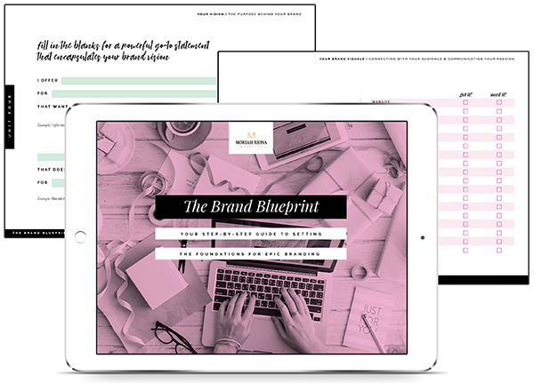
Grab my free workbook The Brand Blueprint — to help you build a stronger brand.