Brand Colors: 5 Steps To The Perfect Palette


May 9
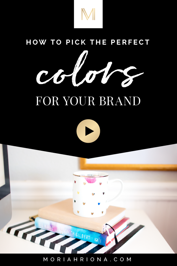
If you’re currently thinking, What?I need colors for my brand? Don’t stress, girl—I’m breaking it all down in my latest video:
5 Steps To The Perfect Palette

This video is actually part 2 of a 5-part series all about visual branding. So if you’re just tuning in, be sure to check out the first instalment here: How to Build a High End Brand
What Are Brand Colors?
The Short & Sweet: They’re a set of standard colors that you use consistently throughout your visual branding.
You might think this is crazy—or that they just don’t matter—but in the video above I play a little game to prove to you just how powerful colors are in visual branding. So, if you haven’t already, hit play!
Alright, you watched the video, so you know how important your brand colors are! So, now what do you do?
Well, if you haven’t been branded by a professional brand designer, chances are that you’ve been haphazardly pulling colors in and out of your visual branding system, maybe for years, not realizing the negative effect this can have.
Good news, girl! I’m going to walk you through the same process I use to create my own clients’ brand color palettes!
Step 1: Build Your Brand Foundation
The very first thing I do, before I ever begin looking at colors or consider designs for my branding clients, is to understand their brand foundation.
Most of my clients haven’t ever done this sort of work before hiring me—so we’ll actually start with a Brand Strategy portion, like my 2-hour one-on-one Brand Intensive—to help them understand the Why behind their business, their brand values, their Ideal Client and all of these core elements which will end up determining the visual branding.
Listen up, Friend: if you gloss over the foundational brand strategy work and go straight to the visual branding, it’ll all just be “pretty fluff”—never effectively communicating your unique brand story. Yes, it’s important. In fact, figuring out your brand strategy is hands-down one of the most important things you can do for the health and future success of your business.
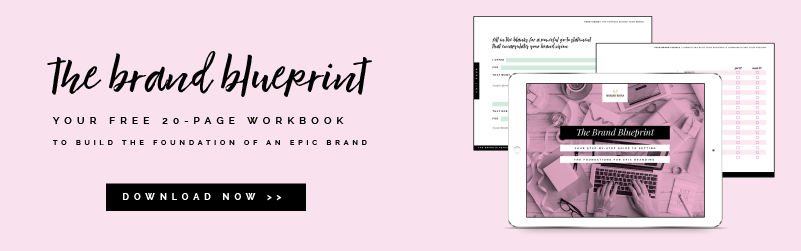
You can start working on your own brand foundation by downloading my Brand Blueprint—a 20-page guide to building a solid brand. It’s totally free—so go grab yours now!
Step 2: Do Your (Brand) Homework
The next step in my process is homework! I give all of my clients homework to complete before we begin their Branding Experience. This includes an in-depth questionnaire—to better understand the branding goals and aesthetics—as well as a secret pin board.
I create a private board on Pinterest for each client where they pin images that reflect their brand aesthetic.
Step 3: Make a Mood Board
Using my client’s secret pin board as inspiration, I create a mood board — which serves as my inspiration for the entire visual branding project.
I choose about 7 images that work together to tell a story about what the brand will look like — including color, texture, pattern, typography and personality.
Step 4: Choose Brand Colors
From the Mood Board, I select six to seven brand colors.
One to three of them will be the “Primary Brand Colors”—these will be the main colors the audience will associate with the brand.
The remaining colors are what I call the “Secondary Brand Colors”—these are the colors that play a supporting role in the visual branding.
Pro Tip: It’s important to choose your primary brand colors and secondary brand colors very carefully! As you may have guessed, they don’t have equal “weight.” You will use your primary colors much more than secondary.
Step 5: Use Brand Colors Effectively Throughout Visual Branding System
One of the final steps in my clients’ Branding Experiences is to finalize the brand color selections. I make sure each one is the perfect shade for their visual branding system—then I find color modes for each.
Because consistency is so vital with visual branding, I provide the values for various color modes for each one of my clients’ brand colors. For my clients this typically includes RGB, CMYK, and hexadecimal color.
This way, my clients are able to always use the correct brand color, no matter what type of brand element they’re creating. (Because the last thing you want to do is pick a color that’s “close enough.”)
Just like an effective logo system and your brand typography, you’ll want to use your brand colors consistently throughout your branding. Then your brand can become easily recognizable from brand colors alone—just like that iconic Tiffany & Co. blue!
So, what do you think? Are you ready to create your own perfect brand palette? If so, what’s your “must have” brand color? Let me know in a comment below!
And if this post and video were helpful I’d be so grateful if you’d share it with another creative friend—or on Pinterest!