Just Launched || Modern Newborn Photography Branding Collection

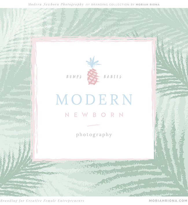
Palm trees and pineapples — not what you’d expect for a Colorado Springs based photographer, who specializes in maternity and newborns! But Dakota Moore of Modern Newborn Photography came to me with a vision of sweet pastels and beachy vibes. And I couldn’t wait to make her rebrand dreams a reality.
After a few years in business, this Florida-girl turned Colorado-girl (and soon to be a Florida-girl again!) was ready to ditch her generic “template” branding and go for something completely custom. Dakota specializes in bright, clean and modern studio portraiture of newborns and mamas-to-be. Over the last couple of years she’s worked really hard to define her own unique style — and she was ready for the visual branding to match.
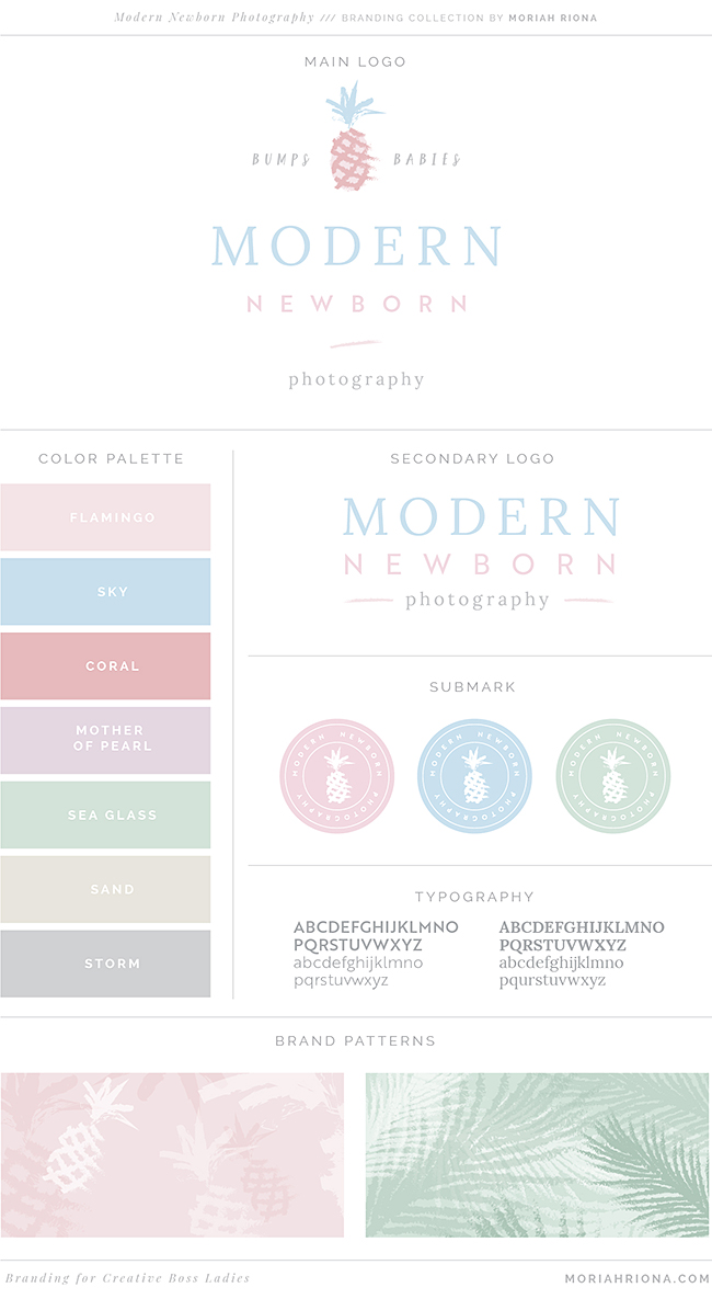
She requested, “No bold colors,” and “They must be thinking of a baby boy or baby girl” in her client brief. (I love a girl who knows what she wants!) Dakota had two key goals in mind for her new logo and brand system: she NEEDED baby blue and baby pink in the color palette… and she wanted a high-end brand — that was also fun and playful.
For me, as a designer, these were two really great challenges! First, how do you create branding for a baby photographer, using pink and blue, WITHOUT it feeling super cliche? And secondly, how do you meld two seemingly opposed traits (“high-end” and “playful”) in a cohesive brand?
The answer: a luxury beach vibe, with a soft colorful palette.

Out of three logo options, Dakota chose this design with a hand-sketched pineapple. We made a few tweaks and from there I created her complete logo and brand system with various logo options and a watermark.
I just loved the pineapple motif, but we both agreed that the overall brand needed something more. So I a hand-sketched a palm leaf element, and hand-sketched lines (that are used to represent waves). We used these little elements throughout her branding. One of my favorite pieces is Dakota’s custom palm tree pattern.
For her brand stationery, she chose square business cards, and I created a different design for each of the three brand elements (pineapple, palm leaf, waves). I also designed a custom notecard and thank you card. But one of my absolute favorite parts is her new wax seal — with the perfect little pineapple in the middle!
Dakota’s Experience
“I’m so thrilled I decided to use Moriah for my rebrand. She is very professional and creative. I am eager to see where my rebrand will take my business.”

Dakota is officially launching her new branding today, so please help me in congratulating her! Seriously, go check out her work — and follow her on Instagram. I just cannot get enough of those sweet, plump, sleeping cherub babies that she wraps up and photographs oh-so perfectly!!
Congrats, girl! I can’t wait to see how you use your rebrand to grow your business.
If you’re ready to ditch YOUR generic “template” branding and get one-of-a-kind custom branding, like Dakota’s
fill out my brand questionnaire here!
If you like this post, you should checkout:
>> Art Gallery Inspired Branding for Wedding Photographer
