Website Design Ideas: 7 Tips to Design Your Website Like a Pro


Jun 6
Looking for website design ideas so you can ace your DIY site? Listen, I’m gonna be honest—as a professional web designer, of course I think you should hire someone to build you an epic website! But I also know that’s not always an option.
So if you’re determined to DIY your website, and not have it come out looking like a hot mess, then I’m gonna help you out!
This month’s topic is… you guessed it—Website Design—and I’m gonna get pretty nerdy (design nerdy, that is)!
Today I’m spilling my secrets! In my new video I’m sharing my top 7 tips for designing a professional looking website (and I’ll be sharing some insight into my own design process!). So, be sure to subscribe to my channel—then hit play:
Episode 116: Website Design Ideas

Tip 1: Design on the Right Website Platform
Not all website platforms are created equal—and you should know by now that you get what you pay for!
Free website builders, like Wix, are a definite no-no. They’re cheap, cumbersome, hard to customize, and unprofessional looking. As much as you tweak and edit those free sites you can never get them quite right.
Guess what, when your website looks cheap and unprofessional, YOU and your business look cheap and unprofessional.
I’ve already touched on this in my video about luxury branding, but if you want to attract high-paying clients who won’t try to nickel and dime you, then you need to look like you’re worth it—which means having a professional and high-end looking website.
So your first step is to make sure you’re on a quality platform!
Website Design Ideas: The Right Platform
My platform of choice is Showit. I design all of my client websites on Showit—and because it allows full customization I’m able to create whatever I want. It’s basically a blank slate. So I can make sure all of my client sites are “on-brand”—looking and functioning perfectly!
Learn more: Top 5 Reasons I Love Showit (And I Know You Will Too)
Tip 2: Brand Yourself Before You Design Your Website
Speaking of staying on-brand, don’t put the cart before the horse when it comes to your website!
I see this a lot with my clients. They come to me wanting a website, because they think a shiny new website will solve all of their problems.
And sure, launching a gorgeous, professionally designed website will definitely elevate you above your “DIY-ed” competitors… but a website alone won’t solve your business woes.
Your website is one single aspect (albeit, a very important aspect) in your overall visual branding system. To design a successful website, you need to design successful branding first.
And no, I’m not just talking about a logo!
My Own Website Design Clients
I’ve worked with all of my web design clients on their branding first. So, when we get to web design I already know those really important branding elements—like their colors, fonts, and overall brand aesthetic.
I also have a whole system of logos on-hand (in the correct filetype of course—and no, it’s not jpeg), so I can incorporate it throughout their website in various sizes and orientations.
So, if you’re just dying to get your business on the internet—or if you’re eager to make it look better—make sure you do your homework and design that oh-so-important visual branding first.
Or even better, hire a professional brand designer!
Tip 3: Get Brand Photos Taken Before You Begin Web Design
I know! You’re just dying to design (or redesign) your site and I’m giving you all of this extra work to do!
But listen, if you don’t do this very important homework first your site won’t be nearly as successful, nor professional looking. So it’s totally worth it to follow ALL of these website design ideas! Believe me.
These days, almost all of my clients go through my entire branding process, which means we’re working together on their brand strategy, their visual branding design, their brand photography (and video), and then their websites. That’s the exact order I always do it in.
My Branding Process
- Brand Strategy
- Visual Branding Design (or what I call The Brand Collection)
- Brand Photography (and sometimes video too!)
- Website Design
There’s a reason I do it this way—each element of this branding process builds on the previous one. I’ve had to tell clients before “listen, I can build you a really gorgeous website, but if we don’t have that strategy, brand design, and photography in place, it’s not really gonna do much for you.”
It’s the whole cart before the horse thing again.
And if you are a photographer (or a designer, or some other kind of artist), and you’re thinking I don’t need brand photography. I’ve got tons of photos from my portfolio—let me stop you right there.
You cannot hide behind your portfolio friend!
Listen, if you’ve watched any of my other branding videos, or read the blog posts, you know that I teach that you are not actually selling your product (of photography, or design, or whatever!). You’re selling an experience, with the on-and-only you.
So heck yes, you need brand photos!
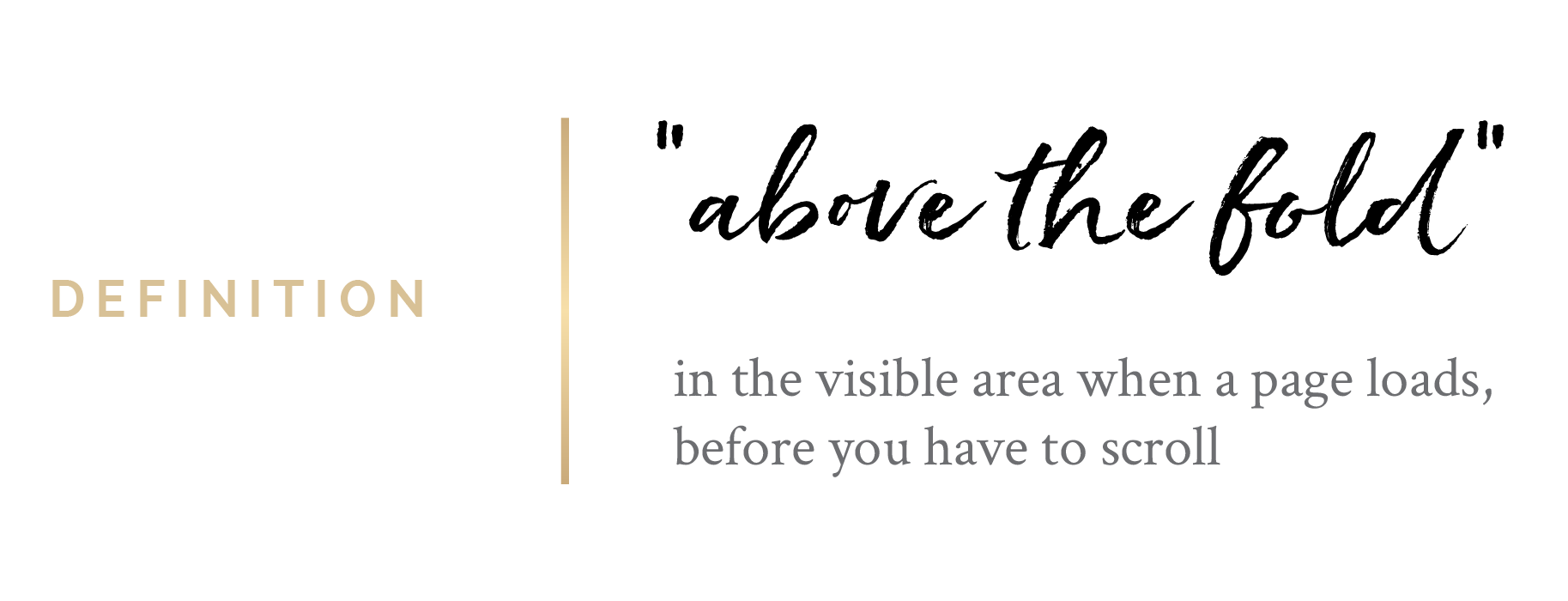
And I want to see them, not just on your about page, but across your whole website. Including on the homepage (above the fold).
Tip 4: Design A Wireframe For Your Website First
Yep! You guessed it. More homework 😉
So, what’s a wireframe you ask?
It’s basically a visual representation of what the website will look like before you create the actual design. Think of it as your design guide.
I create a wireframe for each one of my web design clients—whether they’re coming to me for a full website design, or they’re returning for a new sales page or landing page or something like that.
The reason this is so important is because, with my wireframe in hand, I already know, before I ever sit down to start designing the website, all of the elements I need to include on every. single. page.
Which really helps with the planning process, because I know which graphics, and photos, and videos, and web copy I need for every page!
It also helps my clients when they’re writing (or working with a professional copywriter) on their web copy.
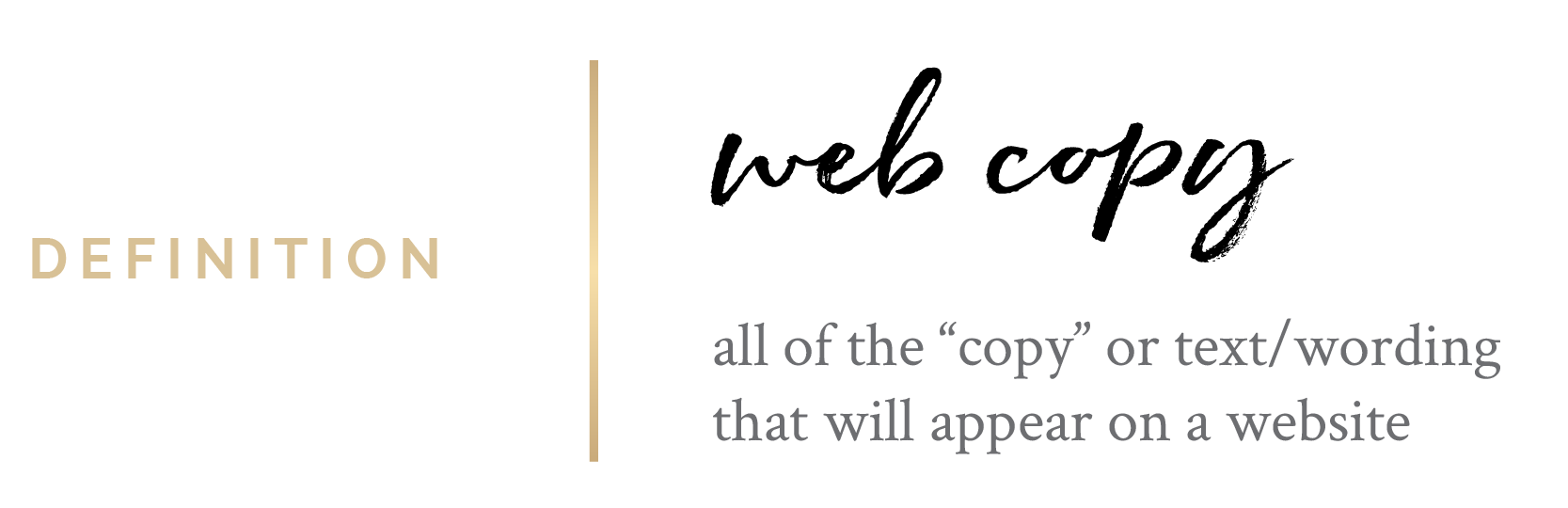
They know, for example, on their homepage we’ll need a great headline, then some body copy that’s gonna go underneath it, then copy for their Call To Action button.
Again, follow all of these website design ideas and do this pre-design work to set yourself up for success! Otherwise, you’re gonna be staring at a blank screen wondering what the heck you should be designing!
Tip 5: Use Negative Space Throughout Your Website Design
So we’re finally getting into some actual graphic design tips—yay!
Okay, negative space—this one is huge! It will totally set you apart from the amateurs.
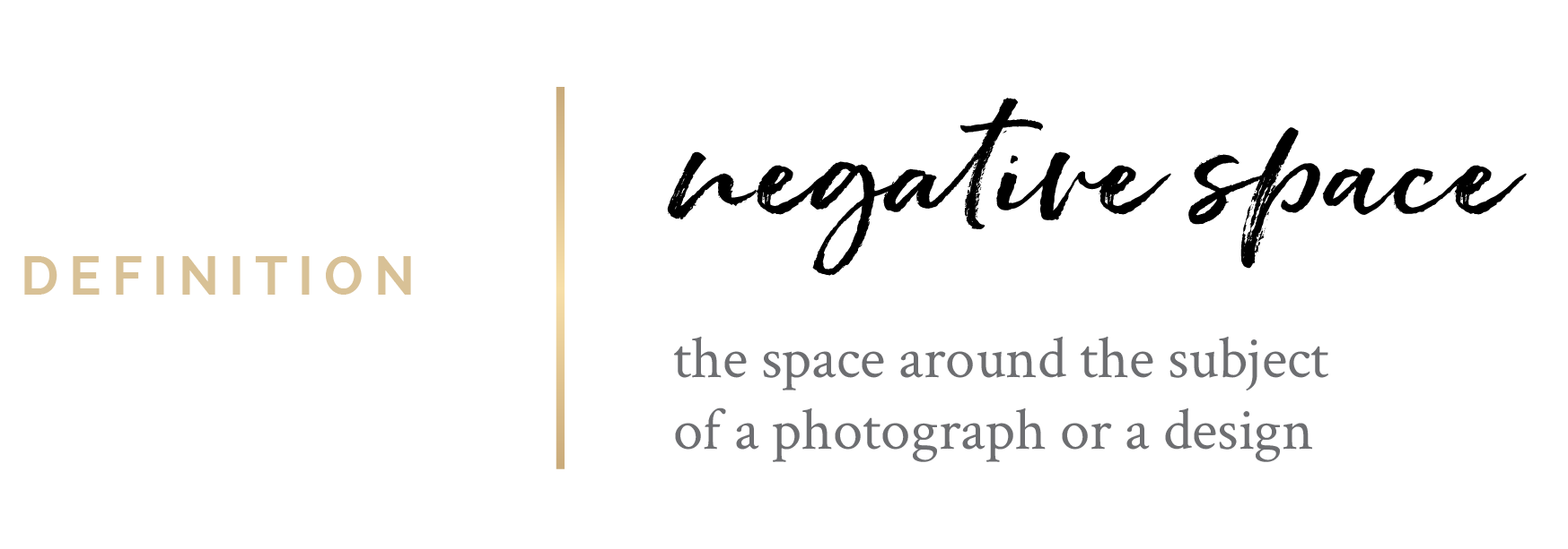
Sometimes it’s called “white space” or “buffer space”—I like to think of it as the breathing room for your design.
And here’s the thing—one of the biggest giveaways to me that a website was created by a non-designer (or a bad designer) or DIY-ed with a website template is when there’s a serious lack of negative space.
This is one of my biggest design pet-peeves. It just drives me crazy!
It actually makes me feel really uncomfortable—it make all viewers feel uncomfortable.
It’s because the design is crowded. It feels suffocating. We don’t know where to look. Everything is screaming for our attention.
Most viewers who land on a webpage without the right balance of positive and negative space are gonna feel overwhelmed—so they’re just gonna bounce right out of there.
And like I said, it’s kind of a dead giveaway that it wasn’t designed by a professional—so your brand, and your business are gonna look unprofessional. And that’s the last thing you want.
Tip 6: Focus on Your Website’s Typography Design
I work with photographers and other creative entrepreneurs—and these people are artists. So naturally, they’re always focused on their artwork and their portfolio on the website.
But here’s a little secret: The typography—the way you handle the words in your site design—can make or break your website.
So you need to give equal priority (or in my opinion, actually top priority) to the typography in your website design. Because here’s the thing, your website’s not just there to show off your pretty pictures.
Your website exists to convert visitors into clients.
Let that sink in: Your website exists to convert visitors into clients.
So you need to be sharing your message eloquently. That’s why I recommend hiring a professional copywriter to help you write the words.
And then follow these website design ideas (or hire a professional web designer) to make sure you ace the way those words are designed!
Learn more: Brand Identity Design: How To Use Fonts In Your Brand
Tip 7: Be consistent with your website design
Inconsistency—this is another one of those dead-giveaways of a DIY website!
I talk about this a lot with visual branding in general, but the same thing applies to your website design. Inconsistency in design subconsciously makes your audience view your brand as flakey and untrustworthy.
On the other hand, when you’re consistently consistent, you build that oh-so-important trust with your audience.
So, if you follow my second tip in this video—to get branded first—you’ll already be starting off on the right foot. You should know what your visual branding looks like, and know how to be consistent with it.
Now your job is to figure out how that translates into your web design.
More than that though, you want to be consistent across the website. There should be an overall visual theme and design language that repeats itself on every page.
If a visitor lands on your homepage, then clicks to your about page where there’s a completely different design style it’s going to feel really jarring.
One idea for this is to treat your website design as a whole project. Think of it as one cohesive design with repeating themes and styles, instead of approaching each page as a separate design.
To recap, if you want to DIY your website and look like a total amateur, here are my top 7 tips:
- Design on the right website platform
- Get branded first!
- Get brand photos taken
- Design a wireframe
- Use negative space throughout your website design
- Focus on your typography
- Be consistent
Alright, friend, its YOUR turn! Tell me the FIRST tip you’ll be using to take your DIY website to PRO-status!