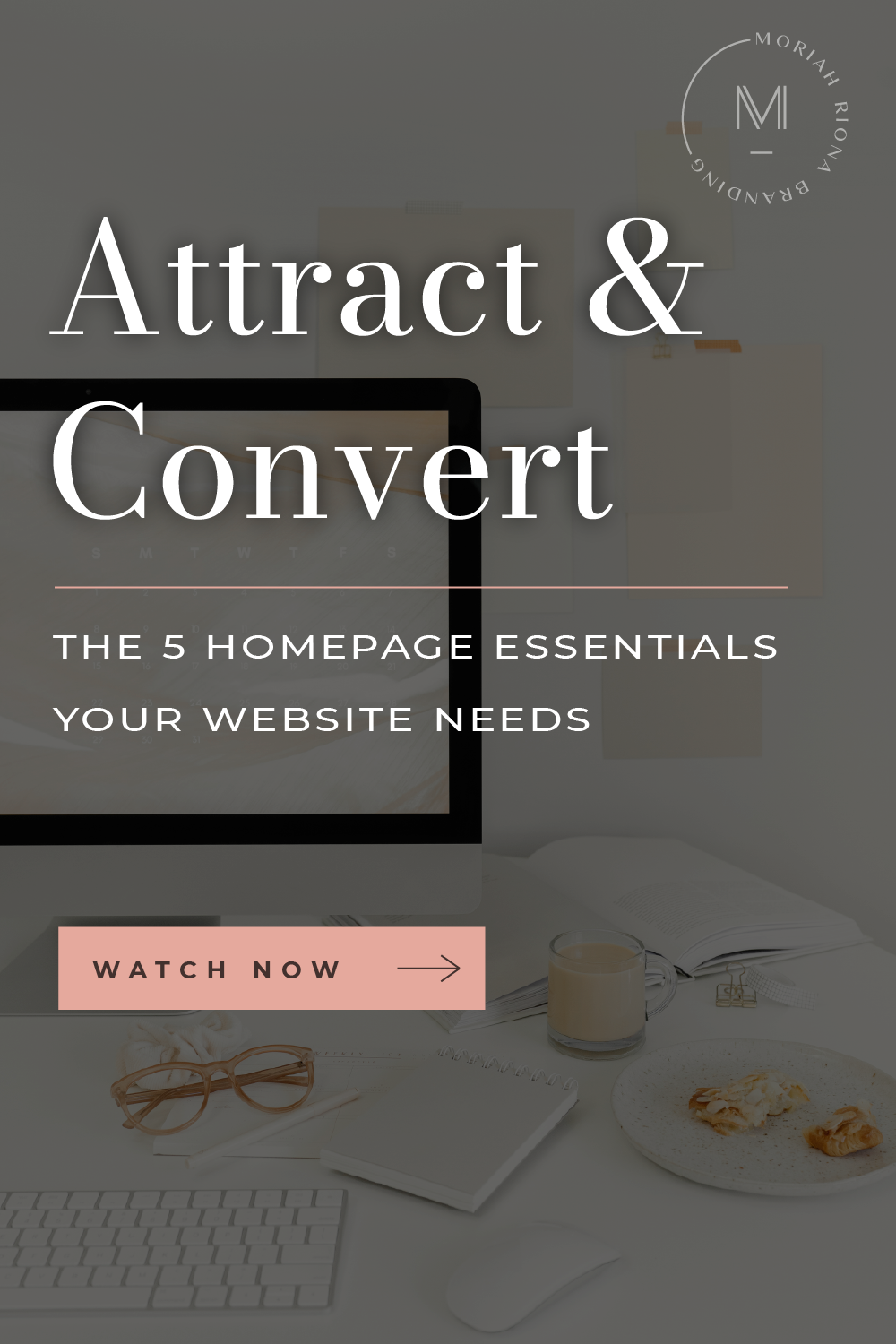
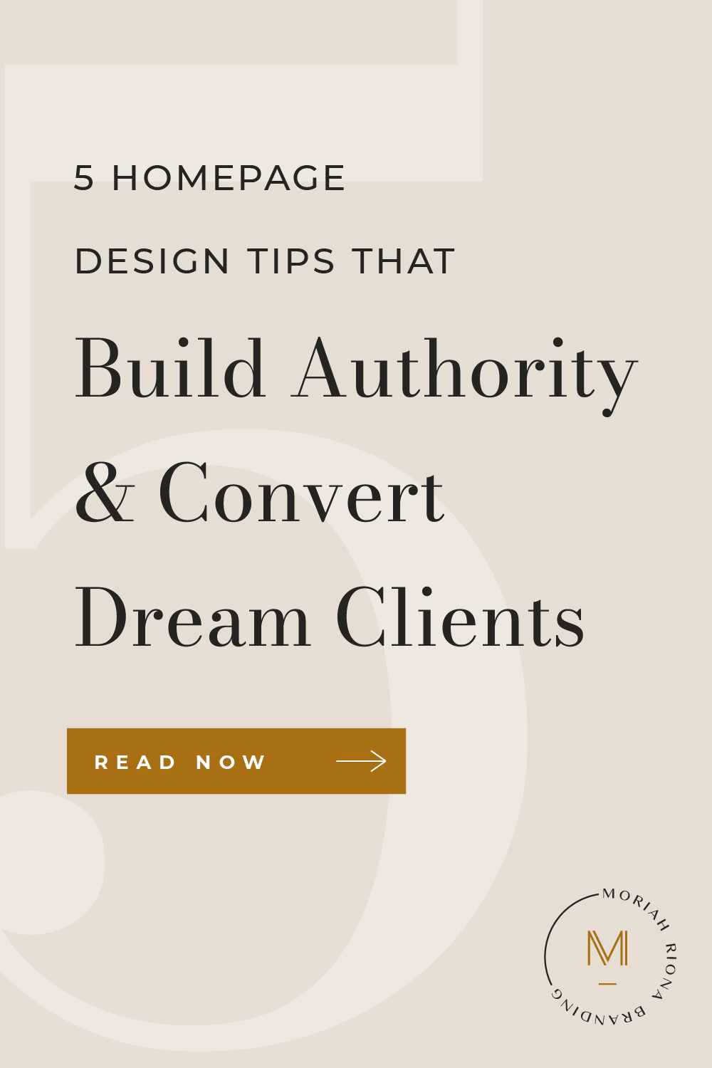
5 Homepage Design Tips that Build Authority and Convert Dream Clients


Aug 2
Is your website attracting the kind of clients you’ve always DREAMED of working with?
Is it converting those leads into loyal, paying clients?
If not, it might be because your homepage design is missing some crucial elements—and that means it’s letting those dreamy leads slip away!
→ Leads that would be PERFECTLY aligned with your services.
→ Leads that would pay TOP DOLLAR for your offering.
→ Leads that would write RAVING testimonials after working with you.
Want to know what goes on a homepage that attracts and converts clients like that?
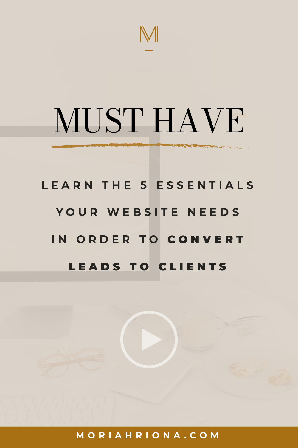
Then stick around, because I’m revealing 5 powerful homepage design tips—and you’ll need to hear ALL 5 home page essentials to get your site in tip top shape.
I’m Moriah—the founder and creative director of Moriah Riona Branding. And I’m passionate about empowering female coaches, consultants, and online entrepreneurs with luxury branding so they can claim financial freedom. On this channel, I share everything I know about building your brand, your online authority, and your audience—so you can charge your worth and build a thriving business.
If you want to learn how to position yourself and your brand as a luxury leader in your niche and start attracting higher-paying clients, be sure to hit that ‘Subscribe’ button below!
In this video, I’m sharing 5 of my best home page web design tips—so you can establish your authority in your niche and convert your dreamiest leads into loyal, paying clients.
Let’s get started!
Homepage Design Tip #1: Make your headline compelling and clear.
Your website visitor should know RIGHT away what your business is all about. A great headline is written clearly—so don’t feel the need to get too clever with it. The purpose of your headline is to grab attention and validate that your visitor is in the right place. In fact, it should instantly repel anyone who doesn’t fully align with your brand.
And your headline should be positioned above the fold—which means your audience will see it at the top of the home page without scrolling. Just like you see here on the website we designed for our client, Nichole McHugh. Nichole’s headline is clear, concise, and compelling. It immediately lets her audience know if her services are right for them so she’s not wasting time on leads that aren’t a good fit.
And our approach for Nichole’s website positions her as a luxury brand—so her headline and design work together to attract the high-ticket clients she wants to work with. Imagine your website doing the work for you and filling your schedule with aligned clients who fulfill you. Sounds pretty nice, right?
Home Page Web Design Tip #2: Create an opt-in form.
Are you capturing your visitor’s email address with an opt-in form? If not, NOW is the time to start! This is so important on a website for coaches and consultants who offer a high-ticket program or package—because most people aren’t going to feel comfortable making such a large purchase from someone they don’t know.
So how do you build trust with the visitors on your website? You grab their email address in an opt-in form so you can connect with them on a more personal level in their inbox. This gives you a chance to deliver value, explain your mission, and position your service as the solution to their problems.
Hit that ‘Like’ button down below if you see why grabbing that email address is absolutely essential!
To see this in action, take a look at another one of our clients’ websites—Mandy Straight. By offering a freebie in exchange for her visitor’s email address, Mandy is able to build her email list and nurture her new lead. This works even better because Mandy’s freebie is displayed prominently on her home page—prime real estate!
Homepage Design Tip #3: Include a mini bio.
Now it’s time to share a little insight into who you are—you know, behind the brand. Your homepage should include a short bio section—because your visitor isn’t just interested in booking a service. They’re interested in who’s behind the service. Take this opportunity to explain why you’re the expert they’ve been searching for.
For some inspiration, check out the bio section we did for our past client, Nicole LaCroix. It conveys her expertise and introduces a human element to her business. See how much more connected you feel to her brand because of this section?
Home Page Web Design Tip #4: Showcase your social proof.
When it comes to conversion, social proof is pure gold. Even the most compelling copywriting on the planet can’t hold a candle to it. More than anything, people want to hear from other people about their experience working with you. So don’t be shy about sharing your best testimonials!
Along with testimonials, make sure you showcase your credentials and press features somewhere on your home page to boost your credibility.
And speaking of credibility, see how we boosted our client, Michele’s? Her testimonials are beautifully showcased right on her home page so you can’t miss them.
Wondering how to start collecting testimonials for your website? It’s simple—reach out to past clients and ask! It may feel scary to do this at first, but you’ll see that many of your clients will be happy to provide this for you. So what are you waiting for? Leave a comment below if you’re going to start reaching out for those testimonials ASAP!
Homepage Design Tip #5: Tell your visitor what their next step is.
You can’t convert a lead into a client without a clear CTA, or call to action. Don’t leave your visitor guessing on what to do next. And at the other end of the spectrum, you don’t want to overwhelm them by sending them in a million different directions.
Figure out the ONE next step you want for them to take. Is it to book a discovery call? Fill out an application? Sign up for your program? Once you have this nailed down, make it super easy for your website visitor to take that action by including buttons throughout your home page.
That’s exactly what we did for our client, Illumine Coaching. Michelle’s CTA buttons drive her leads into her desired next step, which is to learn about her services. From there, they can easily apply to engage her coaching services. There’s no chance of her visitors missing their next step because her CTA is the most prominent button throughout her page.
Here’s another thing about Michelle’s site: we designed it in a way that appeals to high-end clients—so Michelle doesn’t have to worry about attracting bargain hunters anymore. And THAT is the power of luxury branding at work!
Now you’re in on my top design tips for websites—so your homepage can start attracting your ideal leads like a magnet—and then converting them into loyal clients.
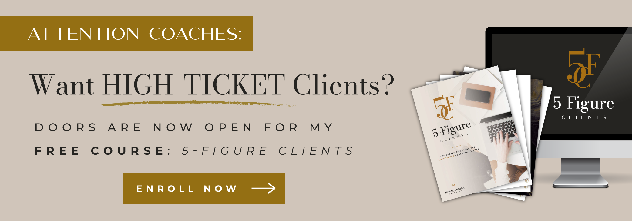
If you want to learn even more about attracting those high-end clients, I’ve created the perfect resource for you! I’ve just launched a FREE course designed to help coaches, consultants, and online entrepreneurs like you attract the clients you’ve always dreamed of. Click here to enroll now for access to this free, value-packed course.
And if you liked this video, I know you’ll love this one. You’ll learn my top 7 tips for designing a professional looking website—so you can boost your perceived value and raise those rates.
Want a weekly dose of entrepreneur and branding tips just like these? Then don’t forget to subscribe to my channel—and I’ll see you in the next video.
Save for later! Pin This: