Mobile Websites: 3 Reasons Why Your Mobile Site Is Costing You Clients

Having a great experience for your mobile website visitors is essential in converting them into clients!
Why? Because over half of all web traffic is now on mobile devices. [source] And a few years ago, Google even starting using a site’s “mobile-friendliness” to determine search engine ranking.
So yeah, your mobile website is pretty dang important!
That’s why, in my latest video, I’m sharing the top three mistakes I see creative entrepreneurs make when it comes to their mobile websites:
Episode 117: Mobile Websites
Mistake 1: Your website isn’t responsive or adaptive
This basically means you don’t have a mobile-friendly website. So when a visitor lands on your website or blog via a mobile device, they’re stuck trying to view an itty-bitty desktop version of your site on their mobile device.
And that means they’d have to zoom and scroll a whole bunch to get to the info they need.
That’s just frustrating. In fact, they’re probably gonna bounce right outta there.
And this is a huge loss to you, the small business owner, because like I mentioned at the beginning of this post, over half of all web traffic is now mobile. So you’re quite possibly losing over half of your potential clients, before they even get a chance to check out your homepage!
So you get it, you need a website that functions on mobile. And really there are two options here—responsive website design and adaptive website design.
Responsive Website Design
So let’s talk about responsive web design first. It’s basically the concept of design that adjusts (or responds) to various screens.
So for example you might have a desktop version that has a very horizontal layout. But on smaller screens, like an iPhone, it’s going to adjust and rearrange the elements so there is more of a vertical orientation.
Adaptive Website Design
The other option is adaptive website design and that’s the idea that there are different designs depending on screen size. Web designers are divided into different camps here, but I’m on the adaptive design team.
The reason is, I like having dedicated designs for both desktop and mobile. Sure it takes more time—it’s sort of like having to design two different websites. But my website platform of choice, Showit, makes it super easy to do this.
You actually get to view both of them (your desktop design and your mobile design) side-by-side in the Showit design software, and can make updates to both designs at the same time.
Learn More: Top 5 Reasons I Love Showit (And I Know You Will Too)
I just love that I have total creative control over how both versions of the site will look. I think it opens the door for much more sophisticated mobile design. And if most of your visitors are viewing your mobile site anyway, I think that’s the way to go!
Mistake 2: Your mobile website is hard to read
Regardless of what type of mobile site you have, one common issue I’ve seen is text that’s too small to read. As I mentioned in the first video of this series, 7 Tips To Design Your Website Like a Pro, the message on your website is vital in converting visitors into paying clients.
So you need to make sure your words are legible.
ACTION STEP: Test out your own website (and ask for others to check it out for legibility as well). If anyone think it’s even “slightly” hard to read, then you need to make adjustments. Bump up the point size on your web copy—

—and even consider making it lighter (or darker) to contrast more with the background.
If your visitors can’t read your site, then you’re not effectively communicating your message. And if you’re not communicating your message—what’s the point of your website?
Mistake 3: Your mobile website “feels”… mobile (and not in a good way)
This is a common issue I see with a lot of those basic template website for photographers, and also those free website builders I talked about in the first video.
Listen, by now everyone knows you need a mobile website, right? So these cheaper web companies are of course going to offer you a “mobile” version of your site.
But they’re not sleek. They’re not sophisticated.
Instead they just feel like a clunky afterthought.
So, if you have a website that works on mobile, but you’ve ever found yourself thinking, “I just like my the desktop version of my site better,” then you know you have a problem!
Because you don’t get to choose how visitors are viewing your website—and most of them are probably checking it out on their mobile device.
So really, you should make it your goal to create a mobile site you love more than your desktop site.
You want a website experience that is flawless, that draws your audience in and effortlessly communicates your brands high-end value—whether it’s on mobile or desktop.

If your website design leaves something to be desired, then get in touch with me! I take my clients’ online brand experiences from drab to fab with custom branding and Showit website design, that puts them miles ahead of their competition—and I’d love to do the same for you!
I sure hope this post was helpful, and that it’s inspired you to take a closer look at your mobile website experience! If you’re ready to take action, let me know in a comment below:
What’s the first change you’re going to make to YOUR mobile website?
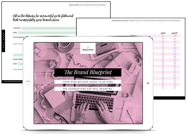
Also, don’t forget to grab my FREE workbook, The Brand Blueprint. It’s a 20 page step-by-step guide to help you build a super solid brand foundation.


